I started reading computer arts magazine and i noticed they had an article that they interview Ed Templeton from Red Design, I immediately thought that i should share this interview from the magazine as I thought it could benefit others and get some quick tips about print design.
Print design isn’t talked about enough in the web design community and id like to learn more about it as I’m from an intense web based background and hopefully others do too, this should be a nice start to a series of posts about print design in the coming weeks if you’d like to contribute a post feel free to contact me.

The Interview from Computer Arts magazine
Make a plan
At an early stage, decide what paper stock you’re printing on and what finish will be applied: matt, gloss, varnish, laminate and so on. Are there any benefits or limitations to your choice of paper and finish that you should bear in mind while designing.
Talk to your printer
Describe your project to your printer to get their grids or agree delivery requirements early on. A good printer will advise you of any potential problems with your design or stock choices – and may offer alternatives.
The Right Tools
Use the right software for the job. Just because you know Photoshop doesn’t mean you should design a magazine in it! Create and amend images in pixel-based programs such as Photoshop; make illustrations and so on in vector based programs; and compile and lay out for print in programs such as InDesign.
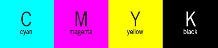
Understand CMYK
The coloured inks Cyan, Magenta, Yellow and Key (or Black) are laid down in that order, Black being last and acting as ‘Key’ that locks the image together. Once you understand the process you can use it in creative ways such as overprinting blocks of C, M or Y or creating a ‘rich black’ of K plus some C, M and Y.
Get colour reference
Using colours swatches at the design stage such as ‘Pantone Solid to Process’ or ‘4-Colour Process Guide’ is invaluable. Most monitors aren’t perfectly print-calibrated, so colours on screen wont look the same in print – check the coated and uncoated swatches to get a better idea.
Working in RGB
When using images its much easier to manipulate an retouch them in RGB mode in Photoshop, When you’re done, flatten the image and convert to CMYK before placing it in your layout software.
Don’t fake fonts
Use only the actual fonts for bold, italic, and other styles when having a document printed commercially. If you’ve used the software fake italic, it’s possible that the text won’t show up as italic when printed. Besides the real font has been designed for the purpose better.
Bleed and Slug
The bleed and slug areas are trimmed away at the documents final size. The former is the area beyond the trim line for images or other elements that you want to ‘bleed’ off the edge of he page. The latter is an area where you can put non-printing information, such as project details.
Do a pre-flight
This is a final quality check that you can perform to make sure the printer is getting all the files, fonts and images in the right formats. It used to be a manual process, but these days most layout programs will do it automatically, so there’s no excuse.
Proof for perfection
Ideally, your printer will provide a proof you sign off before the job goes ahead. If that’s not possible you can run some checks on your print-ready PDF. Using Acrobat to preview separations, ink coverage, transparency and overprinting.
Interview Summary
- know what paper your going to use or want and notify your printer.
- Get advise from your printer, for recommendations on your project that you want printing
- Try to use the right tools for creating print documents such as Adobe InDesign
- Use the actual font that is supplied so if its not italic don’t make it italic in the program such as Photoshop
- Make sure your content is inside the bleed and slug
- Do a pre flight to see if there are any problems with your work.
- Test your document that you have had printed for quality.
More Information
here are a few more things to consider when deciding on your paper choice for print and what effect it will have.
- Opacity of the paper: in reference to how much you can see through the paper e.g. A magazines pages will want less opacity otherwise the reader maybe put off by the text showing through the paper.
- Thickness of the paper: The right thickness of paper should be used as thick paper costs more and can make documents look thicker than they actually are such as books, and e.g. Business cards use thick paper / card.
- Brightness: If the paper is coated in varnish a lot of light will be reflected from the paper, if the paper is too bright this can prevent who ever is reading the page from seeing certain parts. e.g. magazine covers.
- Strength of the paper: paper bags, or shoe boxes have a particular need to be durable and strong due to the amount of weight that will be put on them, where as other things such as magazine pages don’t need to be.
Useful Links about Print
- Crops and Bleeds – Setting up print bleeds in Photoshop, Illustrator and Indesign
- Colour Code Chart – Colour Codes Matching Chart HTML (Convert CMYK, RGB Hex)
- Megapixels – Pixel resolution and print sizes
- CYMK – Every thing about CMYK
- Print Designers – An intresting look in to print design
- Colour Theory 101 – Increasing and decreasing the amount of colour CMYK and RGB
This is just an introduction
Hopefully this post can get you thinking more about printing work to quality standards and preperation, this is just an introduction to a series of posts dedicated to print design and how to go about doing it the right way.
Comments are closed.